מבצע! 15% הנחה
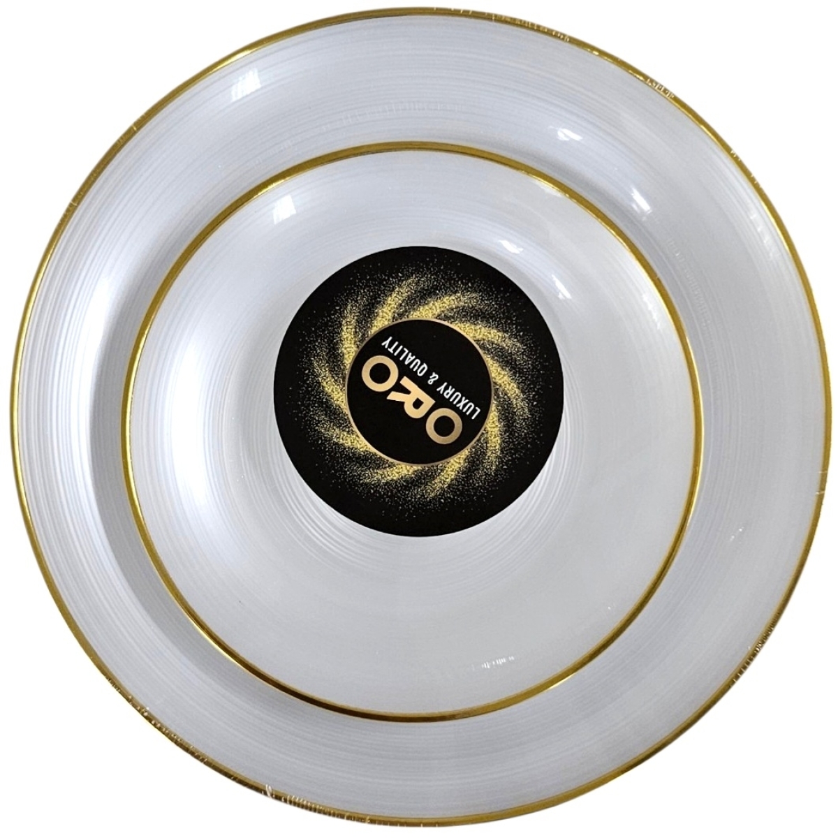
סט צלחות יוקרתי – ספירלה לבן עם מסגרת זהב (8 גדולות + 8 קטנות)
המחיר המקורי היה: ₪28.90.₪24.60המחיר הנוכחי הוא: ₪24.60.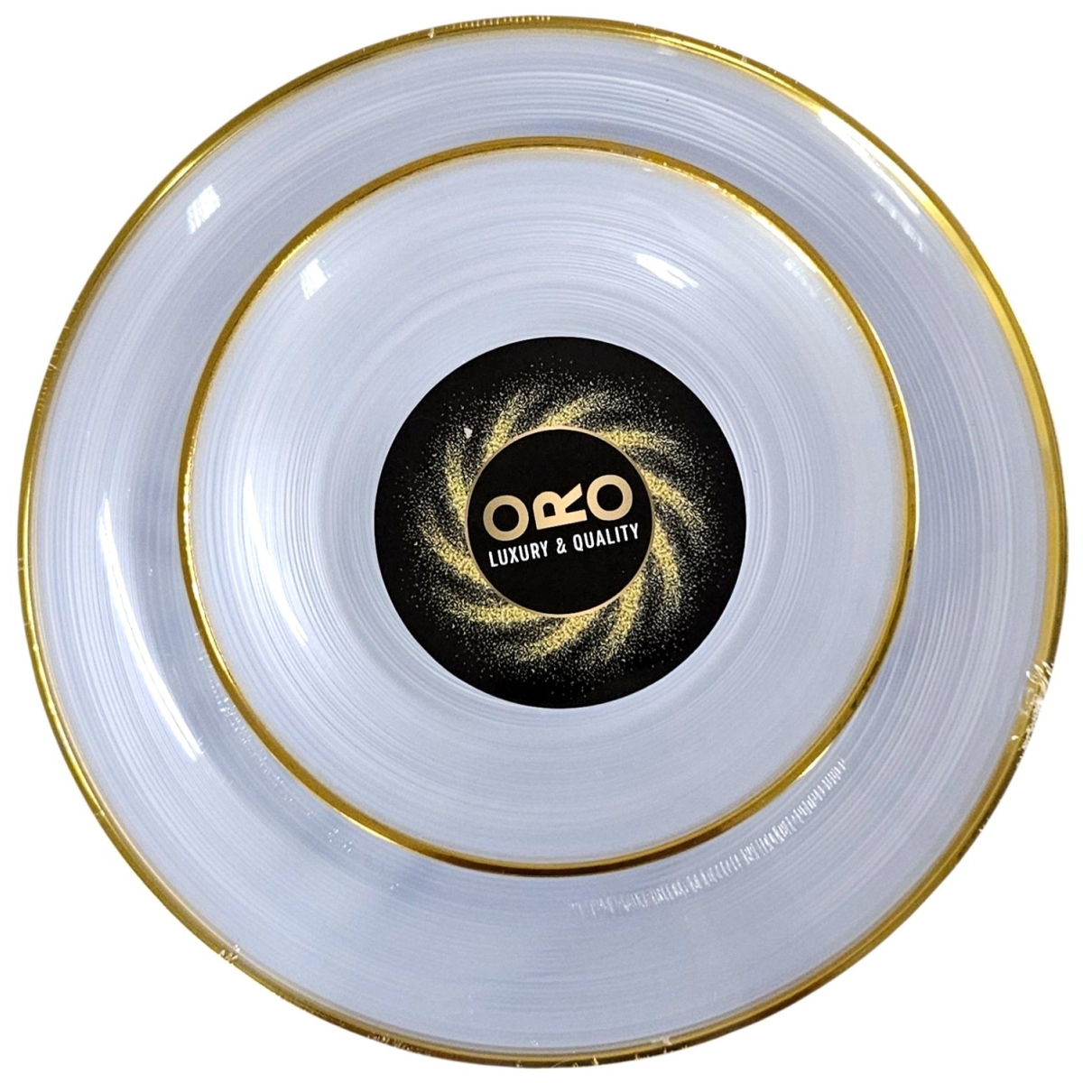
מבצע! 15% הנחה
סט צלחות יוקרתי – ספירלה שקוף עם מסגרת זהב (8 גדולות + 8 קטנות)
המחיר המקורי היה: ₪28.90.₪24.60המחיר הנוכחי הוא: ₪24.60.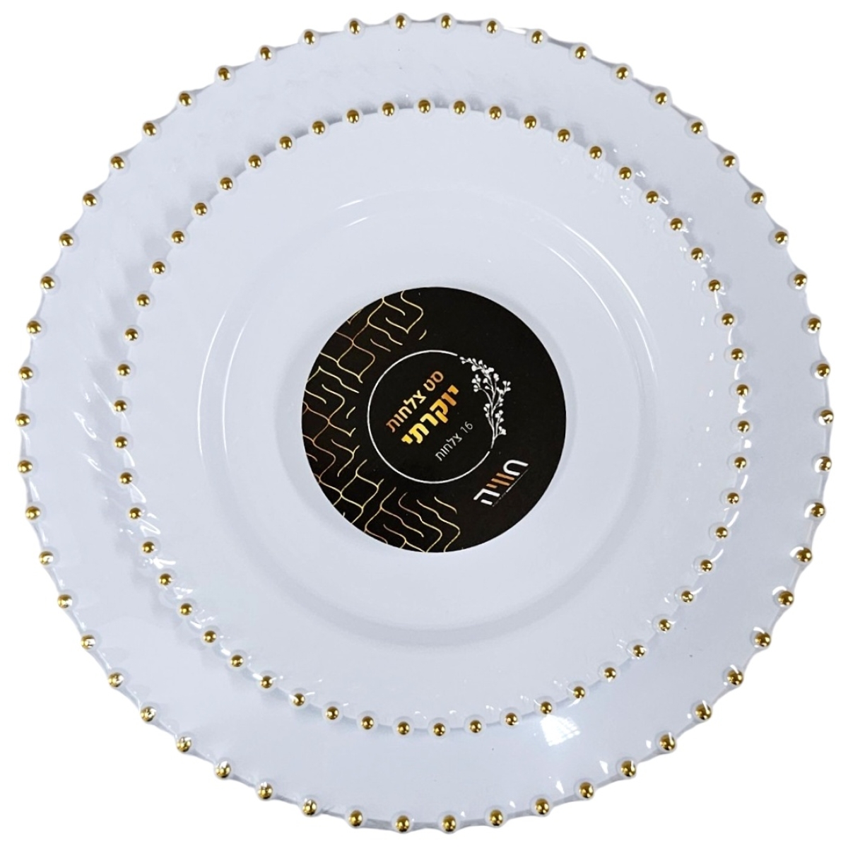
מבצע! 15% הנחה
סט צלחות מעוטרות – לבן עם פניני זהב (8 גדולות + 8 קטנות)
המחיר המקורי היה: ₪23.90.₪20.40המחיר הנוכחי הוא: ₪20.40.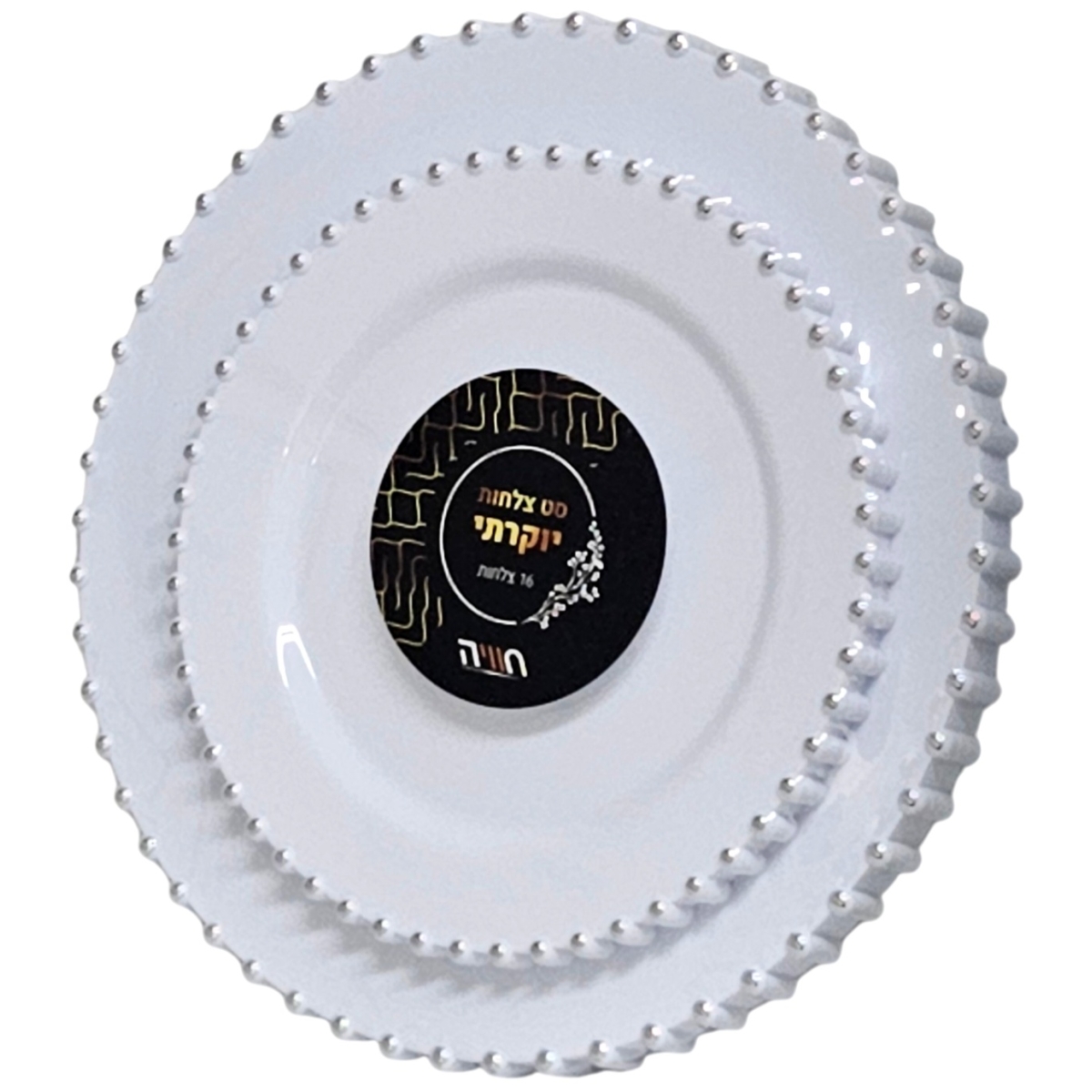
מבצע! 15% הנחה
סט צלחות מעוטרות – לבן עם פניני כסף (8 גדולות + 8 קטנות)
המחיר המקורי היה: ₪23.90.₪20.40המחיר הנוכחי הוא: ₪20.40.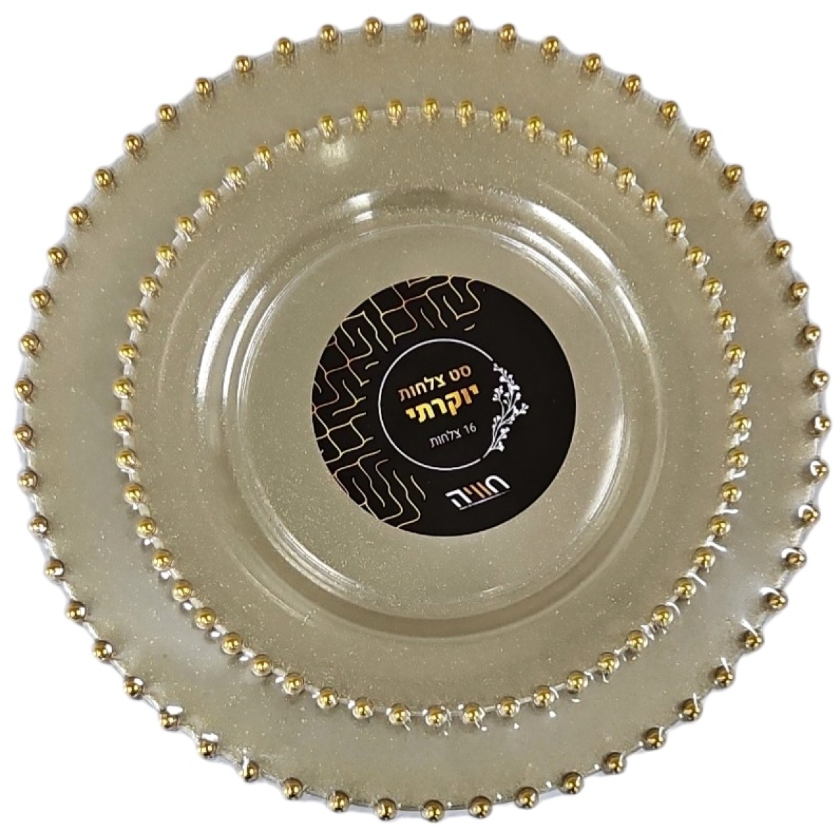
מבצע! 15% הנחה
סט צלחות מעוטרות – נצנץ זהב עם פניני זהב (8 גדולות + 8 קטנות)
המחיר המקורי היה: ₪23.90.₪20.40המחיר הנוכחי הוא: ₪20.40.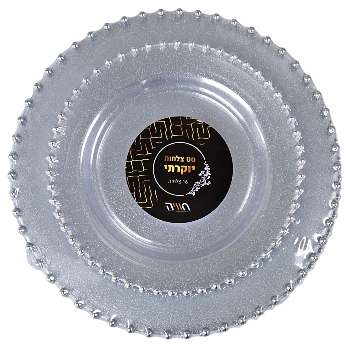
מבצע! 15% הנחה
סט צלחות מעוטרות – נצנץ כסף עם פניני כסף (8 גדולות + 8 קטנות)
המחיר המקורי היה: ₪23.90.₪20.40המחיר הנוכחי הוא: ₪20.40.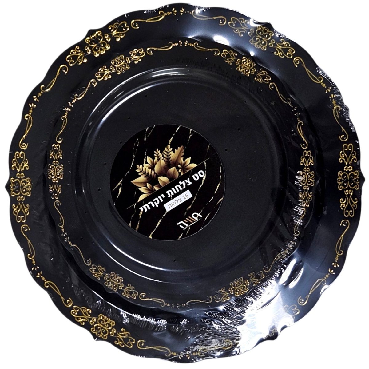
מבצע! 15% הנחה
סט צלחות מעוטרות – שחור עם עיטור זהב (8 גדולות + 8 קטנות)
המחיר המקורי היה: ₪18.90.₪16.10המחיר הנוכחי הוא: ₪16.10.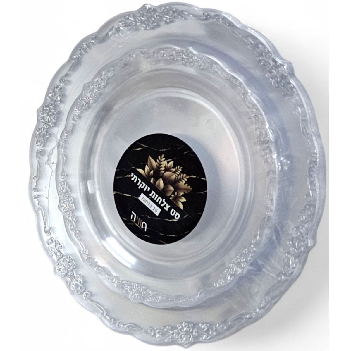
מבצע! 15% הנחה
סט צלחות מעוטרות – שקוף עם עיטור כסף (8 גדולות + 8 קטנות)
המחיר המקורי היה: ₪18.90.₪16.10המחיר הנוכחי הוא: ₪16.10.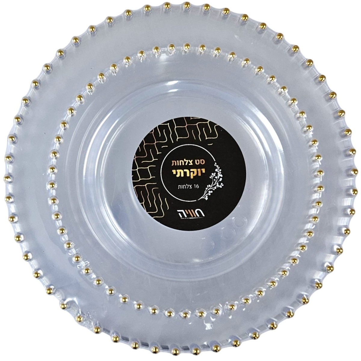
מבצע! 15% הנחה
סט צלחות מעוטרות – שקוף עם פניני זהב (8 גדולות + 8 קטנות)
המחיר המקורי היה: ₪23.90.₪20.40המחיר הנוכחי הוא: ₪20.40.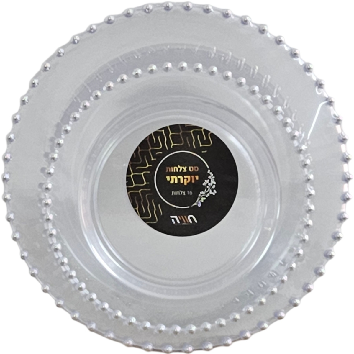
מבצע! 15% הנחה
סט צלחות מעוטרות – שקוף עם פניני כסף (8 גדולות + 8 קטנות)
המחיר המקורי היה: ₪23.90.₪20.40המחיר הנוכחי הוא: ₪20.40.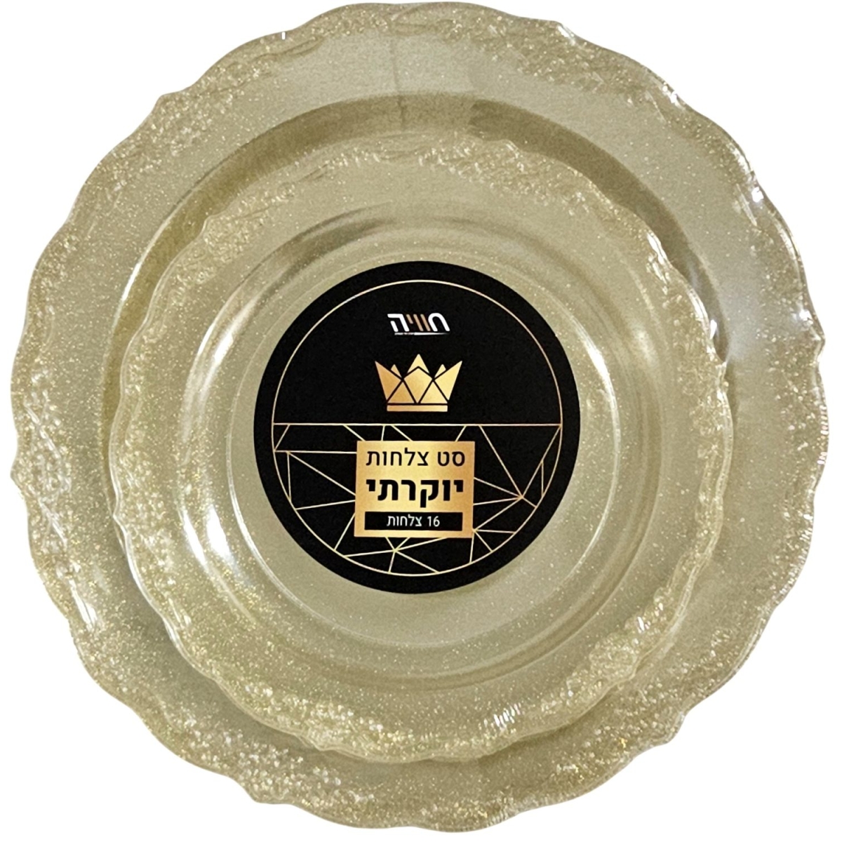
מבצע! 15% הנחה
סט צלחות מעוטרות נצנץ זהב (8 גדולות + 8 קטנות)
המחיר המקורי היה: ₪15.90.₪13.60המחיר הנוכחי הוא: ₪13.60.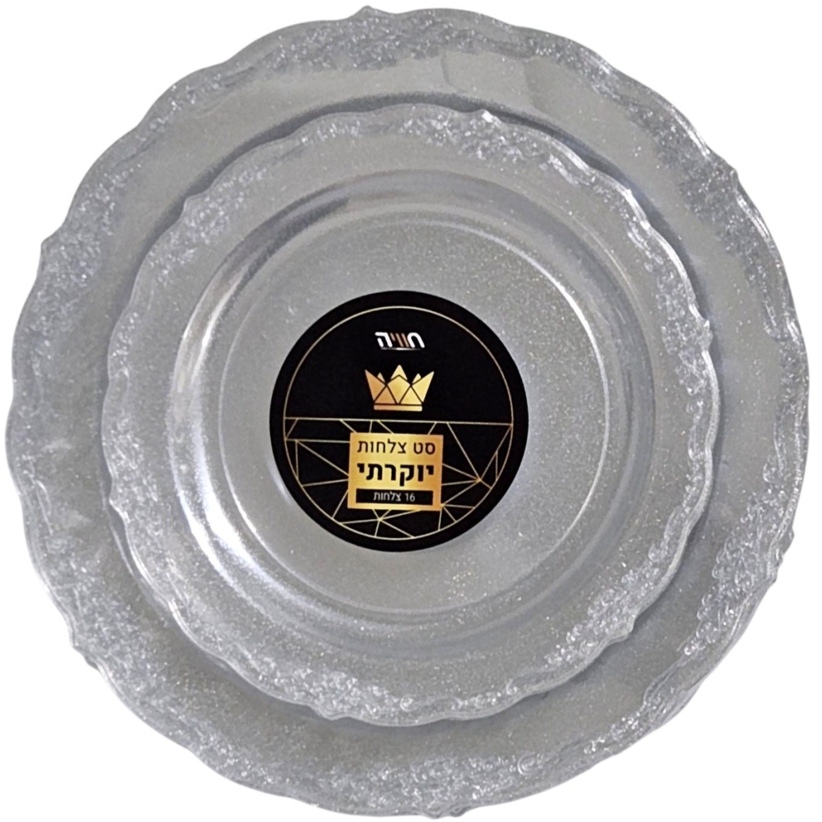
מבצע! 15% הנחה
סט צלחות מעוטרות נצנץ כסף (8 גדולות + 8 קטנות)
המחיר המקורי היה: ₪15.90.₪13.60המחיר הנוכחי הוא: ₪13.60.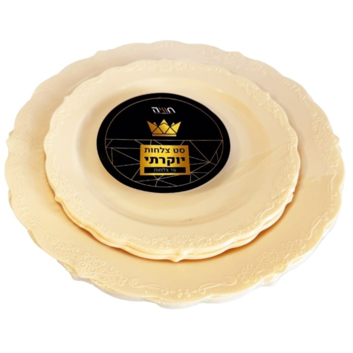
מבצע! 15% הנחה
סט צלחות מעוטרות צבע קרם (8 גדולות + 8 קטנות)
המחיר המקורי היה: ₪15.90.₪13.60המחיר הנוכחי הוא: ₪13.60.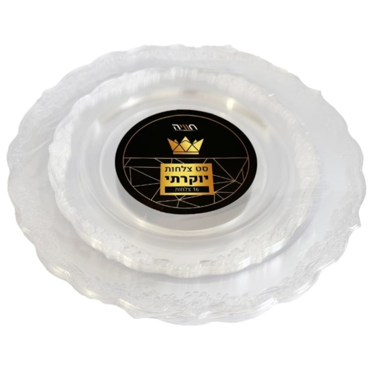
מבצע! 15% הנחה